
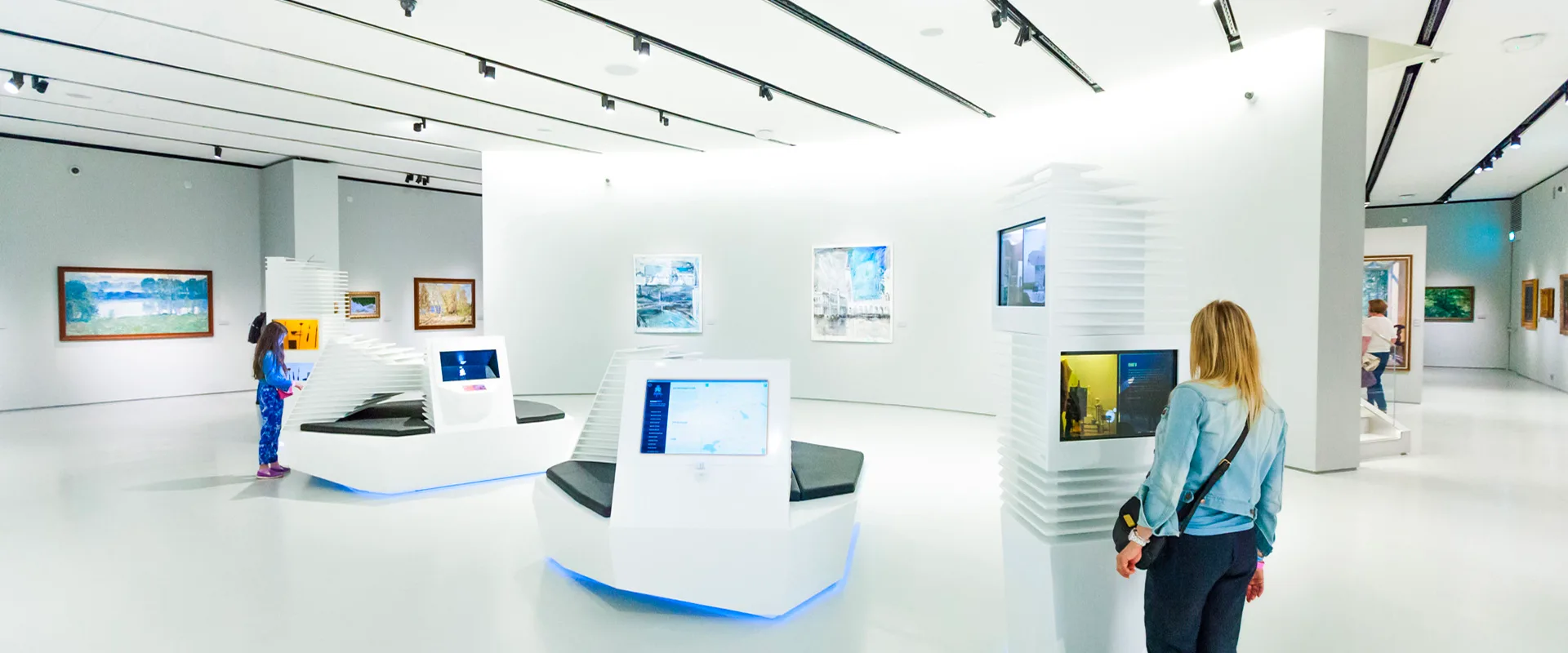
A series of interactive installations for the Museum of Russian Impressionism. The project was created for the museum opening in 2016 and helped visitors look at painting, color, light, artist tools, and cultural geography through short interactive scenarios.
Historically, the work was conceived in the logic of a multimedia zone. This case now presents the project as a series of related interactive installations, not as a claim that all objects still exist in one physical zone. Later, individual installations may have moved, lived on different floors, or stopped working.
Overall task
A museum interactive should not turn the exhibition into a screen attraction. It should help visitors look more carefully.
The common task was to translate complex material into clear actions: choose, turn, compare, mix, move, press. The visitor had to quickly understand what could be done, what changed after the action, and how that change related to the museum material.
My role
The scenario concepts had already been formed by the museum and studio teams, and the museum visual identity was developed by another team.
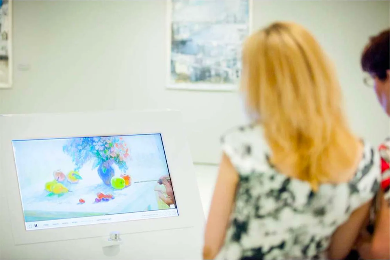
My work started where the general concept had to become a concrete interface. I worked with museum educators on content structure, translated scenarios into screens and states, adapted controls to physical hardware, and prepared prototypes, motion, and client presentations.
Installations
- How Paintings Are Made — a comparison of academic and impressionist painting methods through a wheel controller and a step-by-step process.
- Scientific Experiments: Color and Light — an interactive scenario about color models, color mixing, a projected butterfly, and a controlled light model.
- Artist Tools — a transparent touch screen over real artist tools, with explanations attached to physical objects.
- Artist Workshop Dioramas — physical miniature scenes of studio and plein-air work, where the screen helps visitors look at the scene instead of replacing it.
- Map of Impressionism — a map of places, artists, and works connected with Russian Impressionism.
Common principle
In these installations, the interface had to be a quiet mediator between the visitor, the object, the controller, and the content.
The screen does not argue with the museum material. Hints support looking, but do not replace observation. Physical interaction has to be readable. When a person turns a wheel, selects an object, or moves a light source, the response should be visible and understandable.
For me, this was art direction in a real environment: not an isolated visual effect, but a coherent museum scenario made from content, visual language, physical hardware, development, motion, and visitor attention.